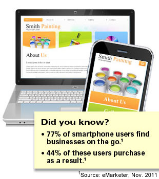
After a brief hiatus, we are back publishing our monthly newsletter. Here at Seascape Web Design, we focus on designing and building websites that you manage. Is your website mobile-friendly? Reach millions of smartphone users with your new mobile-friendly website.
Top 5 Ways to Improve your Website and Make it Mobile-friendly

Surfing the web with mobile devices is no longer just a growing trend – it's a business reality. As tens of millions of smartphones are sold each month, experts predict that more than half of all Internet usage will come from phones and tablets in the next 18 months.
This means that mobile web users are not just a small part of your customer base, but possibly the
biggest part of it. With that in mind, here are five ways to make your business website mobile-friendly:
1. Ask your web developer for a mobile-friendly website design. Designing for smaller layouts that are used in mobile devices is a special skill. Be sure to ask your web developer if he/she has experience in designing and building mobile-friendly websites. Ask to see samples of websites they have designed and built with mobile devices in mind.
I have an iPhone. How do I test my site on Android phones? There are several websites available to test to see how your website displays in the various sizes of smartphone and tablets.
http://www.responsinator.com is a great site that shows you pictures of what your site looks like in Android phones as well as iPhone, iPad and Kindles. Note that responsinator.com looks best on large-width screens such as desktops or laptops.
2. Mobile-friendly websites use a simpler approach.
A lot of the things that were once in style in business web design – like flash animations, long blocks of text, etc. – are no longer preferred. On the one hand, customers are busier than ever, and don't have time to sift through complicated menus and videos to find what they're looking for. Put your logo and contact info at the top of the page so customers can contact you quickly.
3. Use short forms with drop-down menus.
If you've ever tried to type multiple paragraphs in a text message, then you already know why short forms are so important on mobile-friendly websites. Replace text fields with drop-down menus and multiple-choice buttons. The less your customers have to actually type, the more likely they are to actually contact you and make a purchase.
4. Use thick navigation buttons that are easy to use with fingers or thumbs. Many mobile users are surfing the web while on the go – waiting for the bus, walking the dog – and will use their fingers or thumbs to navigate your website. Be sure to use large buttons for submitting forms and larger text for text links. Limit the number of main menu options to 5 buttons or less.
5. Give each page a quick call to action. Give your potential customers the option of taking action like downloading a free ebook, requesting more information or signing up for a newsletter. Avoid asking mobile visitors to do anything complicated or time-consuming.
Need help building a mobile-friendly business website? >>> Contact Seascape Web Design today! <<<
Recently Launched: New Mobile-Friendly Website for JLaanConstruction.com

Seascape Web Design created a custom graphics design for White Rock/South Surrey construction company, J Laan Construction. This business brochure site comes with attractive slideshow and quick contact form. This Drupal 7 website is mobile-friendly and displays beautifully on hand-held devices such as iPhones, iPads and tablets. It also looks great on your laptop or desktop!
>>> Learn How Mobile-friendly Websites Will Increase Your ROI <<<


Comments
Great advice and useful tips.